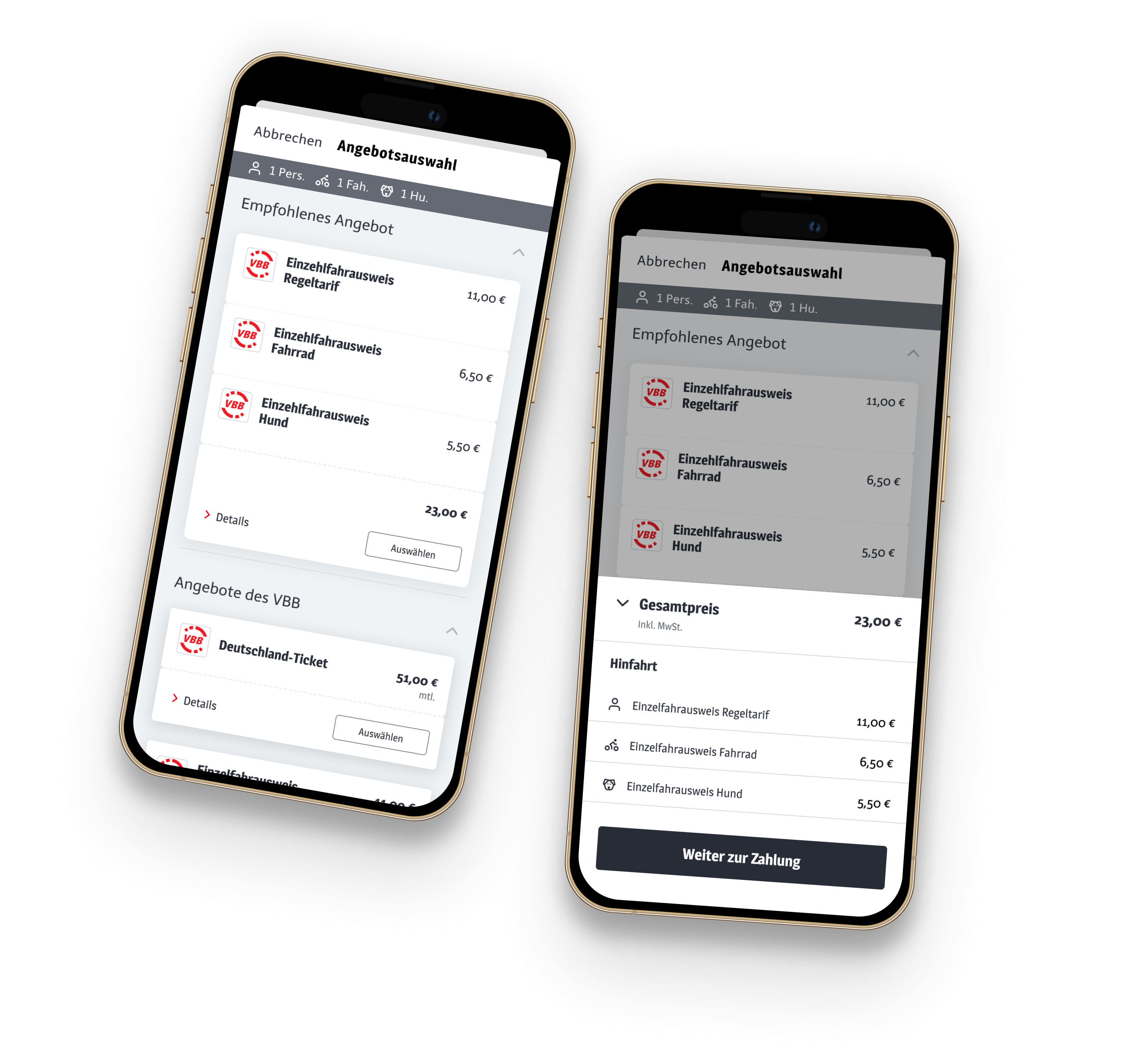
It’s not always the happy flow
Going on a journey with your dog and bike shouldn’t be that complicated — you would think. But when trying to book all three tickets with Deutsche Bahn, it turned into a major struggle. So in this case study, I investigate a more complex booking scenario.
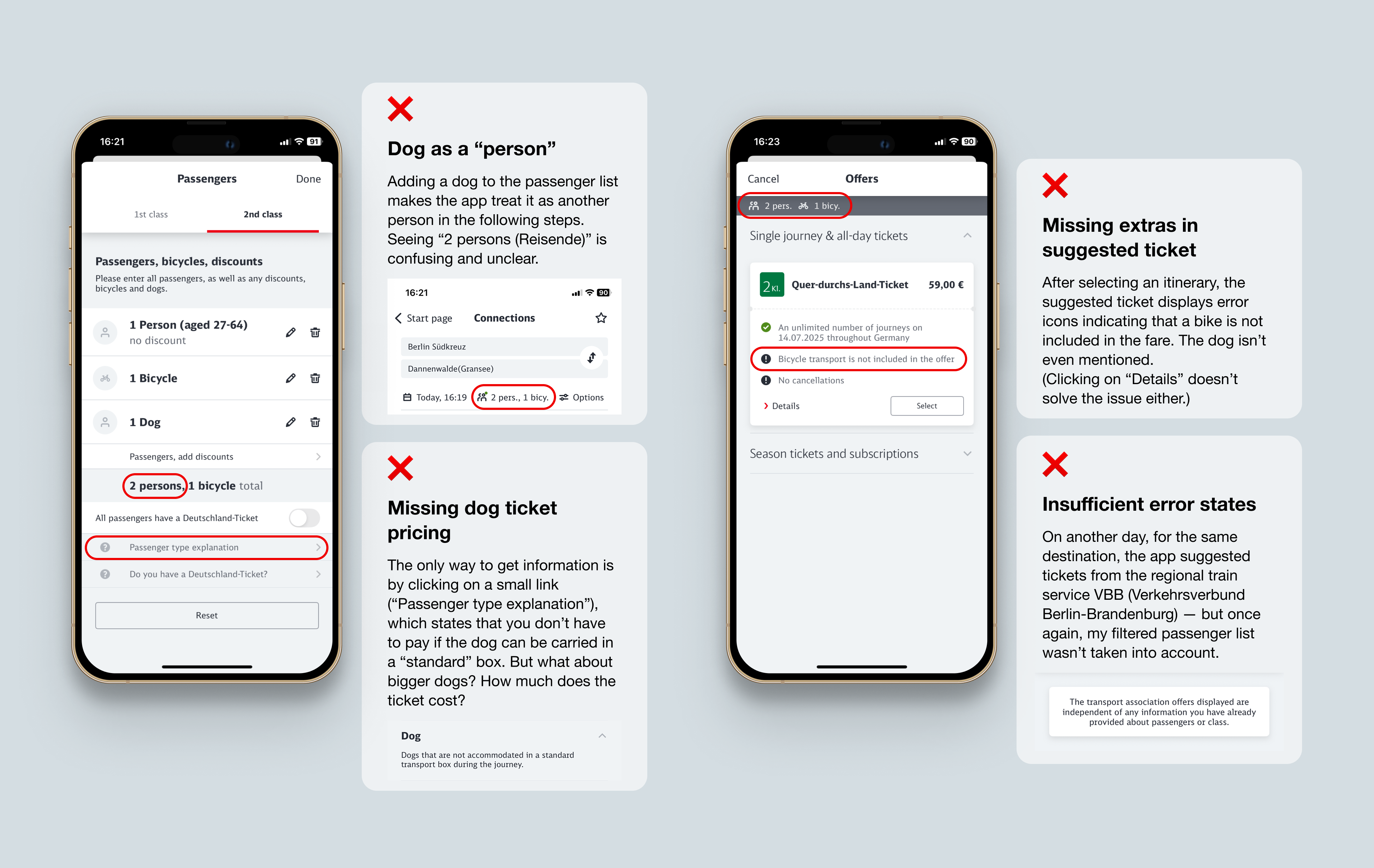
For travelers with more complex needs, Deutsche Bahn’s booking flow is unclear, inconsistent, and fragmented
— key information is hidden behind external links, or missing entirely.
Making complex travel scenarios easy to book
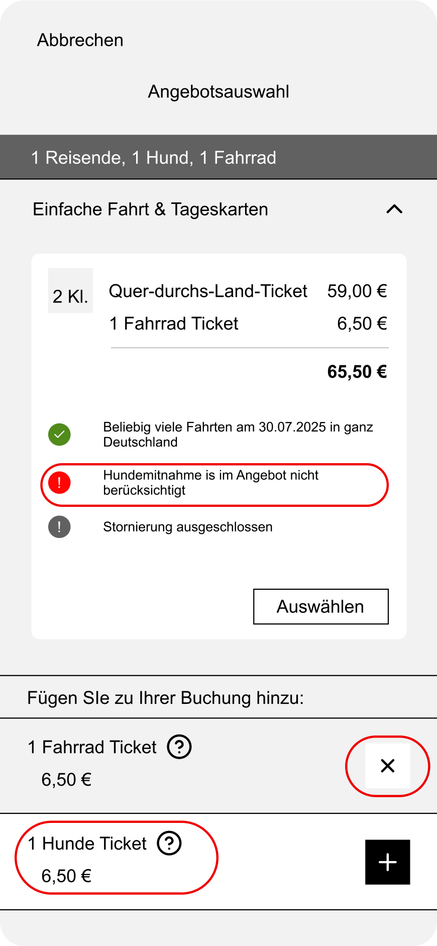
My redesign focused on a straightforward booking experience for bikes and pets, with the possibility to additionally book them or remove them from the booking.
Dogs were treated as a separate entity in the filter system to avoid confusion and provide transparent pricing information.
Filter settings were made accessible from every step of the booking process, not just at the beginning.
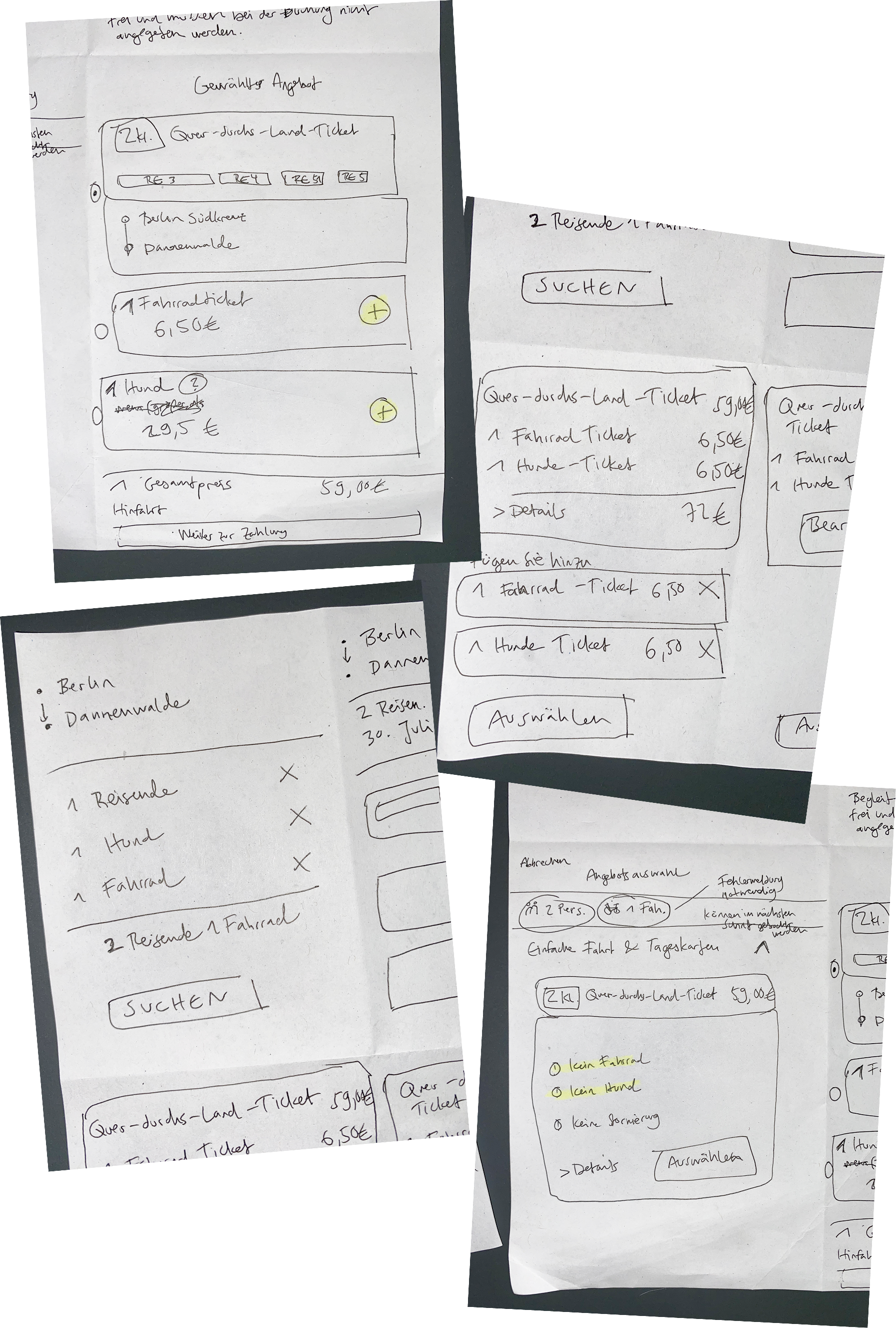
A more user-centered booking experience
Managing travel add-ons like bikes and pets, without breaking the flow.
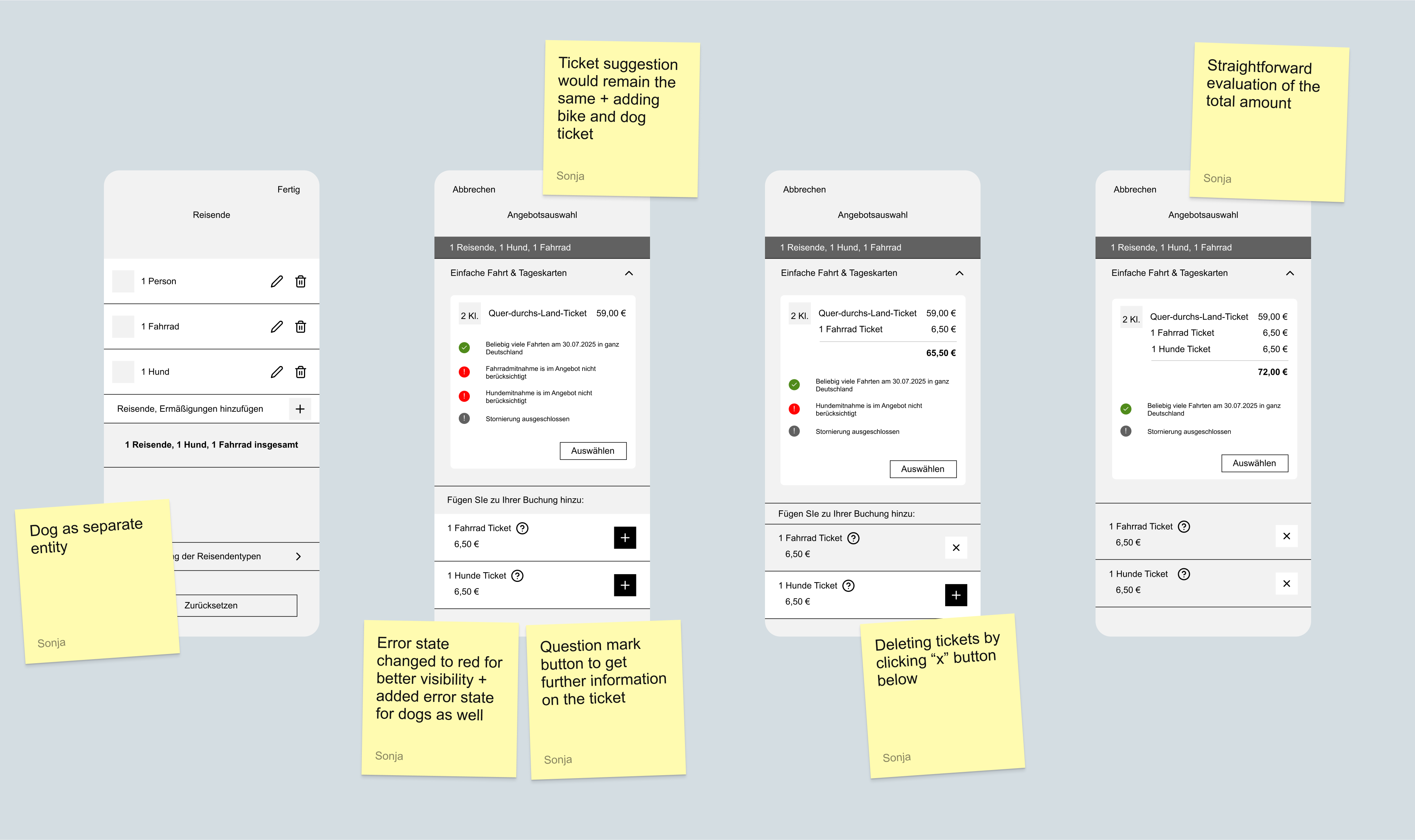
Considerations after testing the flow
After creating and testing the redesigned booking flow, several questions and usability considerations came up:
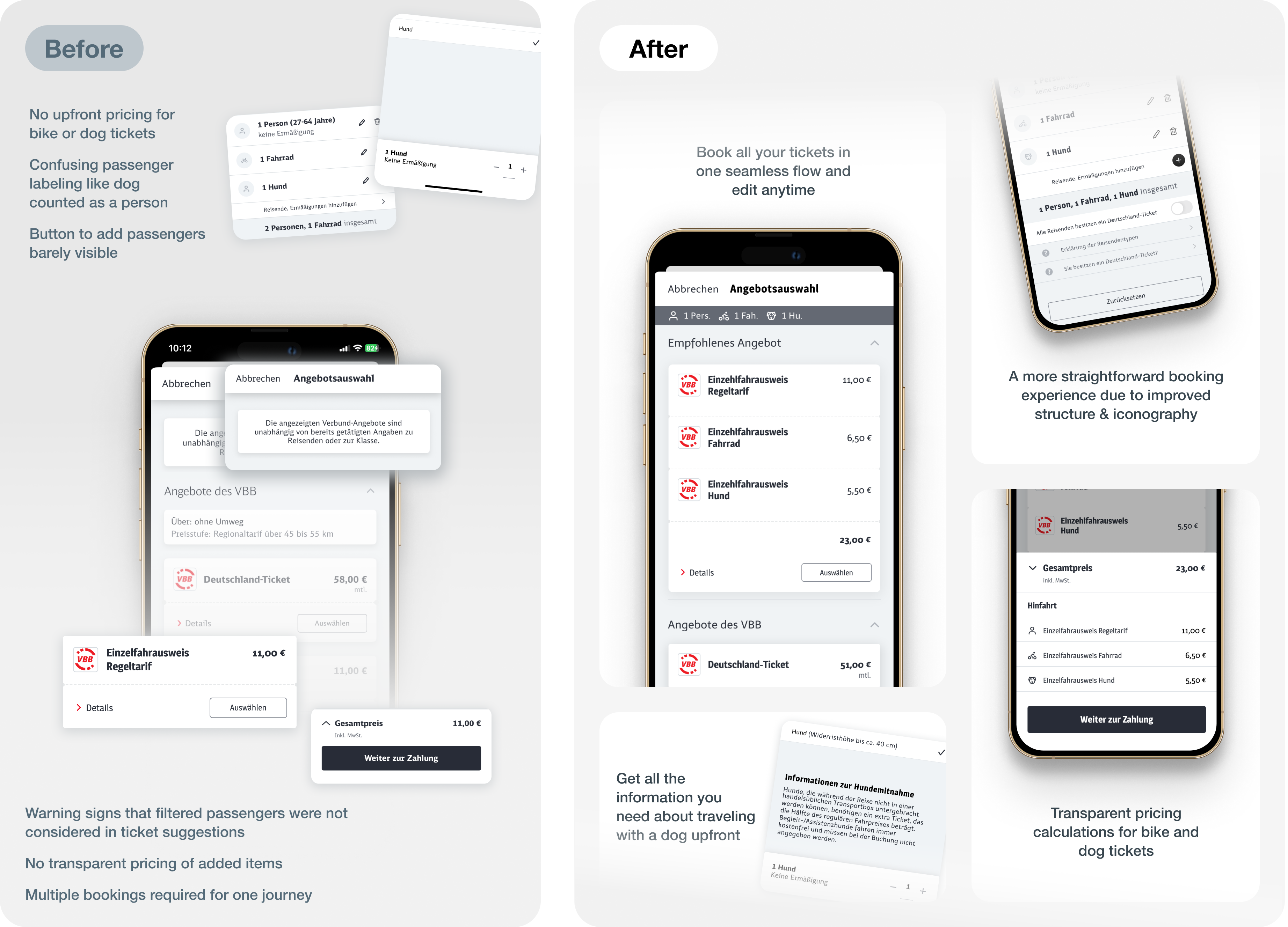
Booking passengers, bikes and pets in one flow
Before and after: unclear add-on pricing and split bookings, versus one seamless flow with transparent costs.
Small issue, big impact
This project began as a self-imposed challenge after my own frustrating experience with Deutsche Bahn’s booking system. At times, I questioned whether the problem was “big enough” to focus on. But I was reminded that even small UX issues can have an outsized impact — shaping how users perceive a brand and influencing their decision to return. While travelers booking with both a bike and a dog may be a minority, the principle applies on a larger scale: if one flow is confusing or incomplete, many other users could be encountering similar friction every day. Designing for these cases not only improves inclusivity but also strengthens the overall customer experience.
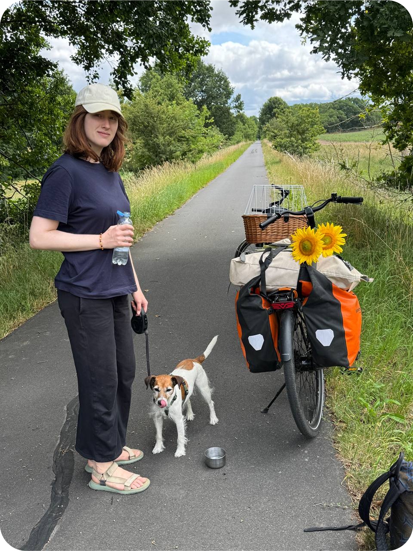
Fortunately, we had a wonderful holiday after all.